Packaging
2026
Onda
A calm approach to botanical refreshment.

Botanical ingredients. A quieter identity.
Onda uses a restrained visual language to communicate flavor and refreshment without unnecessary complexity. A focused palette, simple typography and subtle botanical cues create packaging that feels calm, contemporary and distinctive.
Client
Onda
Industry
Food & Beverage
Outcome
Premium beverage packaging
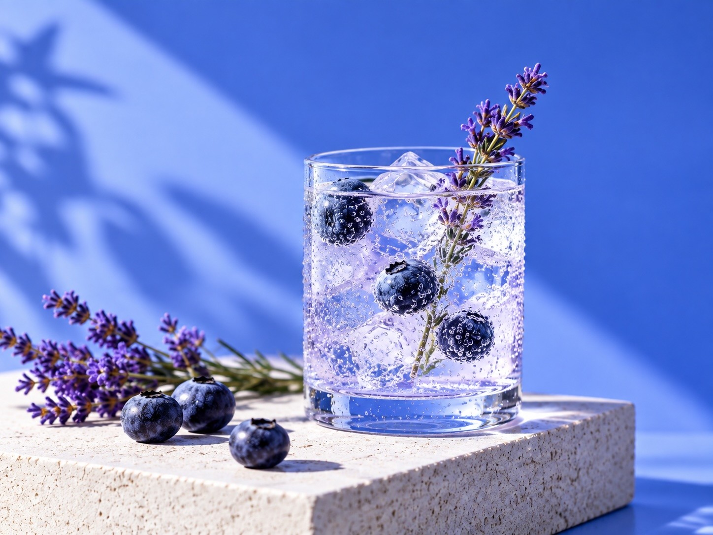


Designed around clarity and atmosphere.
The packaging lets color, material and product photography carry much of the visual character. Minimal typography and carefully controlled details keep the system flexible while reinforcing Onda’s calm, premium positioning.
© 2026 Nico Vale. All rights reserved.